Tips to render the emails properly
Tips to render the emails properly
Tips to render the emails properly
There is the excess of email clients available for an end user and each one renders emails in different ways. On top of it, they each add their own flavor of rendering, classes and security policies. Some of them support media queries for responsive design, most don’t. Microsoft Outlook is the next big player in the email industry after Gmail and Apple mail. Coding the email templates using HTML is complicated and the templates for Outlook gets even more complicated since Outlook rendering issues are emphatically common. A broken email means a disappointed subscriber and it impacts the brand identity in the longer run.
Some tips to fix the Outlook rendering issues
- Use the table based layouts: Email development is not like modern web development. In the email world, using the tables to markup the layout and content is a good practice, especially if supporting Outlook. Most of the Outlook versions don’t support the box model. So to ensure that the layout looks as expected, we don’t use divs and floats, we have to use tables, table rows, and table cells. This ensures your layout and structure stays intact. Here is an example – feel free to play around with the window size to see how the tables respond on different resolutions.
- Protect your images: When it comes to send the images, it is unpredictable whether a client will block your images or not. Therefore it is very important to include a descriptive alt text for your images so the users still get the information you tried to convey with your pictures. Here is the example that shows how alt text still gets your point across even if images don’t load.


- To make sure that the high-resolution images don’t break out of the layouts we need to set the height and width attributes i.e. if the image is displayed at 600px wide in the email then you want to save this image as 1200px wide so it is high resolution and set the width attribute to 600px. Here’s an example of how the image HTML should look:
<img src=”https://your-cdn.com/image.png” alt=”Descriptive text” width=”600px” height=”300px” border=”0” style=”display:block; max-width: 100%;”>
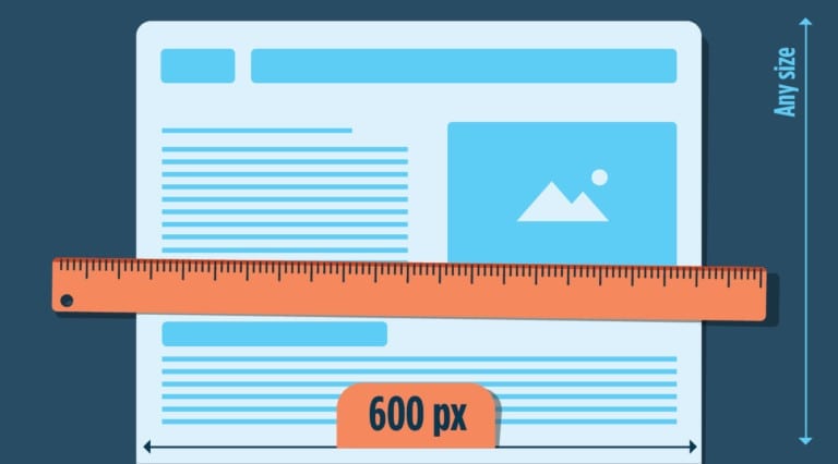
- Use the 600px width: The trick to creating the responsive email templates that render properly on Outlook is to make sure that the template works in the lowest common denominator. In width terms, it means that you need to stick to 550-600px width so that the email template is displayed properly in small screens.


- Stick to an Email-safe font: The designer inside you wants to use the custom font that looks attractive to users and increases the branding. But not all the email clients can support different types of fonts. Using an email-safe font means that all your subscribers will see your text in the same way. Some of the most common email-safe fonts are Arial, Helvetica, Tahoma, Lucida, Verdana, Times, and Trebuchet.
- Use Inline CSS: Various modern email clients have started to support embedded CSS, but most Outlook versions do not support. Even if you link to an external stylesheet, or embed the CSS in the head, you’ll often find that no styles get rendered. They get simply ignored. To fix this issue we need to inline our CSS. Write styles inline with the HTML elements.
Conclusion
The email templates in Outlook are tricky, so even after following the best practices, it goes without saying you need to test your email templates to make sure that nothing breaks.


