
Xamarin Forms enables cross platform mobile application development and renders the User Interface according to the targeted platforms. Every User interface has its own render defined for each supported platforms, i.e. Android, iOS and Windows, to draw the controls and visualize the appearance of the control.
Sometimes while developing an application, customization of styling and appearance of the controls is required and in Xamarin Forms this can be achieved using the Custom Rendering. In this article we will try to understand how to override the existing control appearance.
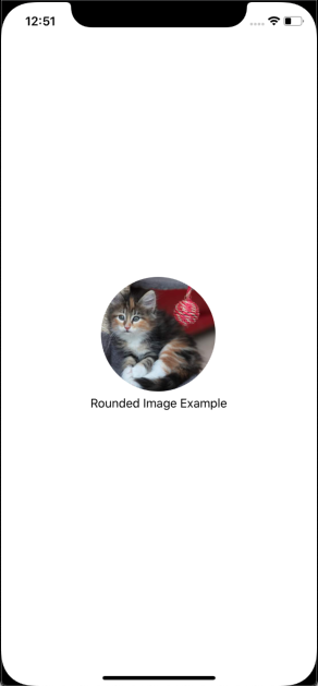
In this blog, I will demonstrate how to customize the appearance of the Image control and display the images in circle shape, the default shape of the Image control in Xamarin Forms is a rectangle.
Here are the steps to customize the Image controls in Xamarin Forms using custom rendering:
Step 1: Place Image control in the Content Page, refer the below code snippet:
<StackLayout HorizontalOptions="Center" VerticalOptions="Center">

        <Image Source="https://placekitten.com/400/400"

               HeightRequest="150" WidthRequest="150"

               HorizontalOptions="Center" VerticalOptions="Center" />

        <Label Text="Rounded Image Example"

               HorizontalOptions="Center" />

</StackLayout>
Step 2: Create a subclass of the ImageRenderer at each platform and to override the OnElementChange method of the ImageRenderer class to change the shape of the Image.
Write the logic to change the shape of the Image control in the OnElementChange method of the subclass of the ImageRenderer.
Step 3: Register the subclass of the ImageRenderer class with Xamarin Forms renderer, so that Xamarin Forms should utilize customize style while rendering an image.
To register the custom renderer with Xamarin Forms, paste the below code snippet top of the namespace of ImageRenderer subclass:
[assembly: ExportRenderer(typeof(Image), typeof(RoundedImageRenderer))]
Refer to the below piece of code after integrating the Step 2 & 3 in the subclass of the ImageRenderer class on both Android and iOS platform:
RoundedImageRenderer.cs (Android)
using System.ComponentModel;

using Android.Content;

using Android.Graphics;

using Java.Lang;

using RoundedImageDemo.Droid.CustomView;

using Xamarin.Forms;

using Xamarin.Forms.Platform.Android;


[assembly: ExportRenderer(typeof(Image), typeof(RoundedImageRenderer))]

namespace RoundedImageDemo.Droid.CustomView

{

    public class RoundedImageRenderer : ImageRenderer

    {

      public RoundedImageRenderer(Context context) : base(context) { }


protected override void OnElementPropertyChanged(object sender, PropertyChangedEventArgs e)

      {

            if (e.PropertyName == VisualElement.HeightProperty.PropertyName ||

              e.PropertyName == VisualElement.WidthProperty.PropertyName )

            {

                Invalidate();

            }

      }


      protected override bool DrawChild(Canvas canvas, Android.Views.View child, long drawingTime)

      {

            var result = false;

            try

            {

                var radius = (float)Math.Min(Width, Height) / 2f;

          var path = new Path();

          path.AddCircle(Width / 2.0f, Height / 2.0f, radius, Path.Direction.Ccw);

    canvas.Save();

          canvas.ClipPath(path);

    result = base.DrawChild(canvas, child, drawingTime);

          canvas.Restore();

     }

           catch (Exception ex)

            {

                System.Diagnostics.Debug.WriteLine(ex.Message);

}

      return result;

}

    }

}
RoundedImageRenderer.cs (iOS)
using System;

using System.ComponentModel;

using System.Diagnostics;

using RoundedImageDemo.iOS.CustomView;

using Xamarin.Forms;

using Xamarin.Forms.Platform.iOS;


[assembly: ExportRenderer(typeof(Image), typeof(RoundedImageRenderer))]

namespace RoundedImageDemo.iOS.CustomView

{

    public class RoundedImageRenderer : ImageRenderer

    {

protected override void OnElementChanged (ElementChangedEventArgs<Image> e)

{

base.OnElementChanged(e);

if (Element == null)

return;

DrawRoundedImage();

}


             protected override void OnElementPropertyChanged(object sender, PropertyChangedEventArgs e)

{

base.OnElementPropertyChanged(sender, e);

if (e.PropertyName == VisualElement.HeightProperty.PropertyName ||

e.PropertyName == VisualElement.WidthProperty.PropertyName)

{

DrawRoundedImage();

}

}

private void DrawRoundedImage()

{

try

{

var min = Math.Min(Element.Width, Element.Height);

Control.Layer.CornerRadius = (nfloat)(min / 2.0);

Control.Layer.MasksToBounds = false;

Control.ClipsToBounds = true;

Control.SizeToFit();

}

catch (Exception ex)

{

Debug.WriteLine(ex.Message);

}

}

    }

}
Congratulations you have customized ImageControl, now run the application you will see the ImageControl in round shape.